
Part 1 covered Headings and Links
Much of the content we create uses images. Accessible content will always have a text equivalent to convey information a sighted reader would get from an image. Or, if an image is purely decorative, and not meant to convey any information, there will be markup to tell screen readers that the image can be ignored.
Most of you are probably familiar with adding alt-text to images: a short description of the image you’ve added to your content that gives a text equivalent of the information the image is meant to convey. Or, blank or null alt-text (alt-text=””) if the image is purely decorative.
But adding good alt-text is much more difficult than adding any alt-text. There is a definite art to writing good alt-text, and it pays to put some thought into it. It is highly dependent on what the purpose of the image is, and what other HTML and text is around the image.
Also, if you are using images as links, remember that images that are links ALWAYS need to have a text alternative. So if you have a purely decorative image with alt-text=””, don’t make that image a link! For images that are links, remember that the text alternative should describe the destination of the link, not the image.
Writing Good Alt-text
Writing alt-text for more complex images, like a chart or graph, can be a challenge. Generally you want to keep alt-text short—at most a couple sentences. So, the data presented in a chart or graph should be available in text nearby the chart or graph, and the alt-text can point the reader to the right place.
Here are some general guidelines for good use of images and alt-text:
- Remember that the context of the image is really important. Your alt-text will depend a lot on your purpose in adding the image, and the text/html that surrounds or is nearby the image.
- Keep the alt-text short. Don’t include unnecessary text like “A photo of Pikes Peak”, unless the medium is important to the purpose of the content. So, for example, if you’re writing about the differences between a photo and a painting, say, then identifying the medium in the image description might make sense. But otherwise it’s usually unnecessary.
- Like with links and good writing generally, don’t repeat yourself, and keep things as short as possible.
- Images that are links *always* need alt-text, and the alt-text should describe the link, not the image.
- Decorative images, or images that do not by themselves add more information to the text, should have blank or null alt-text (alt-text=””).
- Complex images, like a chart or infographic, also need text equivalents, even if that equivalent is too long to go into the alt-text attribute. The explanation of a chart or graph can be in nearby paragraph text, and the alt-text can point the user to where they can find more information.
- Make sure the image itself can be understood by people with vision different from yours, like people who have various types of color blindness.
Alt-text Examples
For some practice writing good alt-text, I highly recommend WebAIM’s guide to Alternative Text. It has a series of examples with multiple-choice answers to allow you to practice writing good alt-text. Yale’s guide to image accessibility is also quite good, and it has links to further guides and information.
But there isn’t necessarily one right answer to what the alt-text for a given image should be. A lot depends on your purpose in adding the image, and the text and HTML markup around or near the image.
Let’s look at one of the examples from WebAIM’s page to see how purpose and context can affect alt-text.
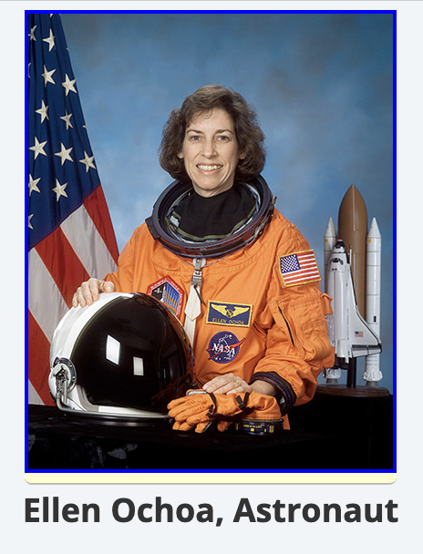
In the example on the right, we have a photo of Ellen Ochoa, a NASA astronaut and the first Hispanic woman to go to space. It is within a link to the Wikipedia entry for Ellen Ochoa, and directly beneath the image is a heading that reads “Ellen Ochoa, Astronaut.”
WebAIM gives you these options as possible alt-text for the image:
- “Read More”
- “Astronaut Ellen Ochoa”
- “Wikipedia entry for Ellen Ochoa, Astronaut”
- empty
altattribute (alt="")
Clearly, the first option is not acceptable–it is just a generic phrase that gives the user little information about the content of the image or the destination of the link. Similarly, the last option can’t be correct. The image is contained in a link, so it definitely needs some text alternative.
WebAIM says the best option is the second one, “Astronaut Ellen Ochoa.” It is simple, though it would be a little repetitious for a screen reader, which might render it as: “Link, Image, Astronaut Ellen Ochoa. Ellen Ochoa, Astronaut.”
But I prefer the third choice, which I think more clearly describes the destination of the link. WebAIM says the third choice “provides content other than that conveyed by the image—the fact the link goes to Wikipedia.”
The point I want to make here is that the correct choice is up to you, the content-creator. So think about why you’re including the image in the first place, the role the image plays in relation to the text surrounding or nearby it, and choose your alt-text from there.
Alt-text for Complex Images
This is an example from the Yale guide. Here we have a complicated flowchart describing Yale’s foreign language requirements.
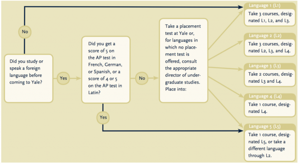
You need to keep alt-text fairly short, so you can’t possibly describe this chart within the alt-text attribute. Let’s assume, though, that the essence of the flowchart is explained in the paragraph following the image. So something like a basic description, followed by a pointer to where the information contained in the graphic is fully explained, would be good alt-text. Perhaps: “Yale foreign language requirements. See below for discussion.”
Proper Contrast for Charts and Graphs

This is an example from Penn State Accessibility Guides, another good resource for accessibility information. We’re getting away from alt-text a bit here, but why might the lovely chart here be an accessibility problem?
It relies on the user’s ability to distinguish between red, blue, and green in order to properly read the chart. But people with red-green color blindness will not be able to understand this.

Instead of relying solely on color to differentiate the data series, you can revise the chart to use varying shades, or pattern fills, and also clearly label the different bars, so the inability to discern the chart’s color and shade differences will not keep users from getting the information the chart is meant to convey.

- Global Accessibility Awareness Day - May 21, 2026
- New Federal Accessibility Rules - March 16, 2026
- Filtering Bot Traffic in Google Analytics - February 26, 2026