
Good contrast between an element’s foreground and background is a vital part of accessibility. It helps make your content perceivable (one of the four principles of accessibility) to users. Color contrast standards in part address concerns of users who have impaired vision, like various forms of color blindness, or permanent or temporary low vision. But good contrast also helps those with unimpaired vision by making your content more legible and easier to scan.
There are different color contrast standards for different kinds of text. WCAG AA minimum standard is a contrast ratio of 4.5:1 for body text and UI components (like buttons), and at least 3:1 for large text. The more stringent AAA Enhanced standard calls for a minimum contrast ratio of 7:1 for body text and 4.5:1 for large text.
There are many tools available for checking color contrast and helping you choose color combinations that meet contrast guidelines. Here are my favorites. They all have what I think of as the essential characteristics of a good contrast tool:
- They update the contrast ratios live, as you drag through different colors
- They have easy-to-use color pickers that accept a variety of input types
- They clearly show what standards your current combination meet and don’t meet
- They can suggest color combinations that meet the required standards
- They allow you to easily share color choices with others by including the chosen combinations in the URL
Color Kit
My first choice is Color Kit. Of all the tools I’ve used, Color Kit most clearly shows what standards your color choices are meeting and failing. It gives nice examples of the color combination as it appears for a heading, body text, and in icons. You can even modify the text of the example heading and body paragraph.
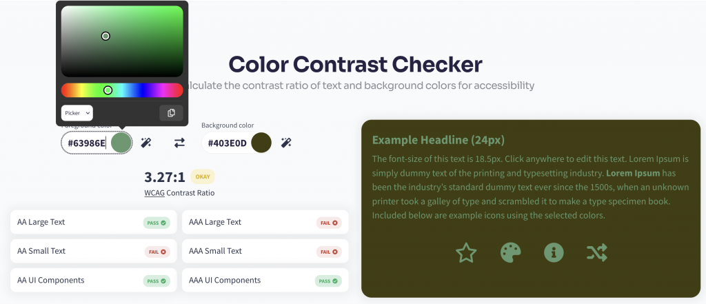
Its color-picker is very easy to use, and you can click a little magic wand icon to have Color Kit suggest AAA compliant colors for you by changing either the foreground or the background color.
If you want to paste or type color values in, Color Kit will accept them in most formats, from named colors, to hex codes with or without the leading hash (#), RGB, RGBA, or HSLA, though it will immediately convert those values to hex.
The only drawback for me is that you can’t ask Color Kit to suggest AA compliant colors–it will only choose AAA compliant.
Coolors
Coolors is also very easy to use. Its color-picker is very slick, and has more options for color formats than any other I’ve seen. If you want to paste in values it accepts them in nearly any format (then converts them to hex).
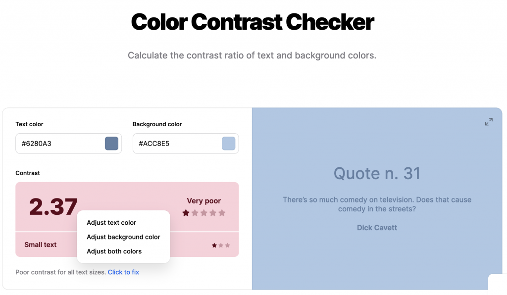
It gives an example heading and body text, and it has a nice “click to fix” function that will automatically adjust the foreground, background, or both colors to a compliant pair.
One of its drawbacks for me is that Coolors doesn’t show as clearly as Color Kit what standards are being met – it just gives rankings from “very poor” to “excellent.” Also, if you ask it to suggest a compliant combination, it will choose one with a very high contrast ratio of 10:1, which exceeds AAA standards. You can’t ask it to suggest combinations compliant with a lower standard.
Polypane Contrast Checker
The browser/development tool Polypane has a nice Color Contrast App. It has a nice color picker, and allows you to toggle between AA and AAA compliance levels.
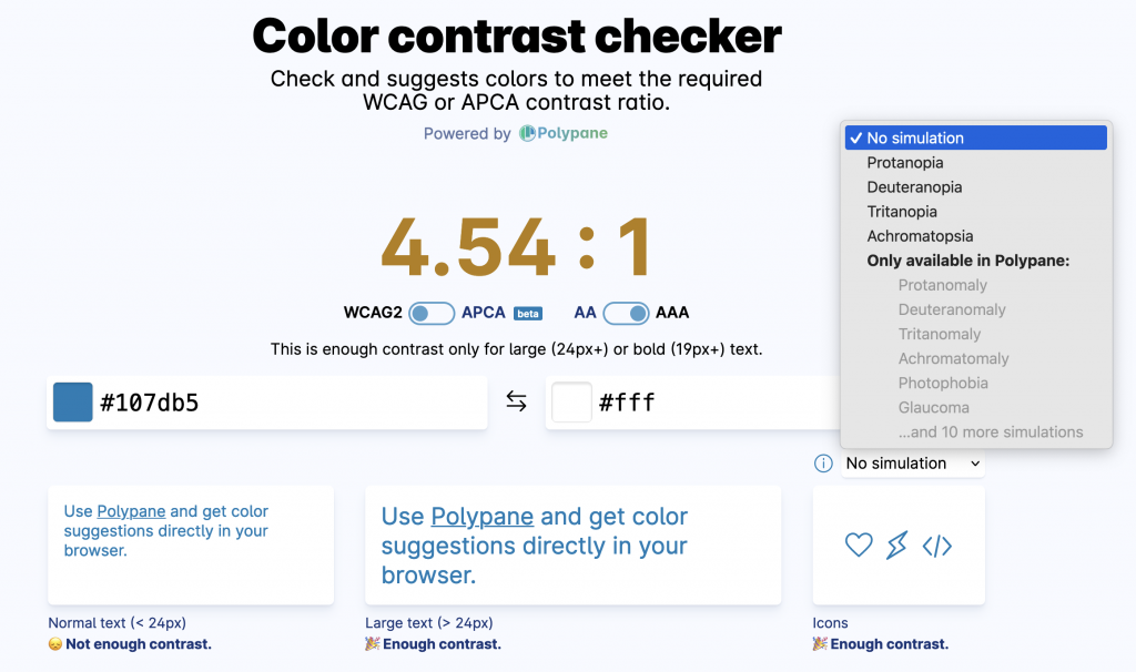
It also has built-in simulations of several types of color blindness so you can experience how your color combination might appear to those users.
It does not show AA and AAA compliance simultaneously, and it can’t suggest compliant combinations.
Contrast Checker from Acart Communications
The agency Acart Communications makes a Contrast Checker that, while inferior in some respects to the ones previously mentioned, has a useful feature for collaborative work.
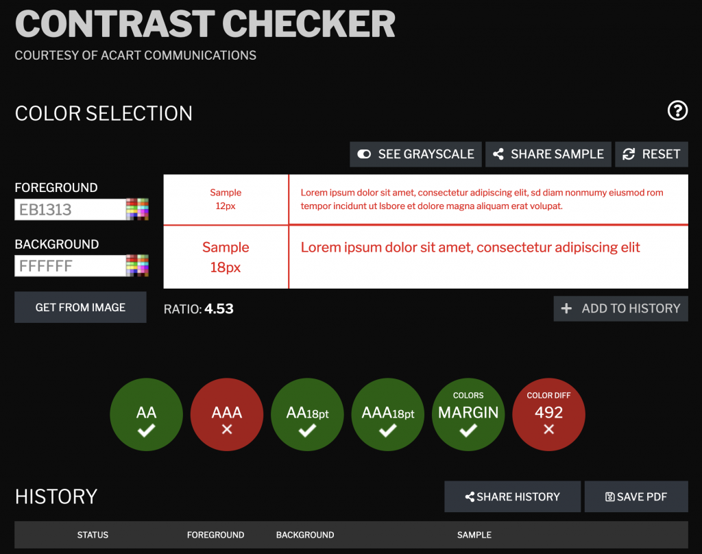
Its color picker is a bit more clunky than the others, but is serviceable. It shows clearly what standard is being met, and it has the option to view your chosen combination in grayscale.
Its greatest asset, though, is its ability to add color combinations to a history, and to easily share that history with others. None of the other tools I’ve seen has this capability – they can only share one combination at a time.
Link Contrast
Finally, here is one more specialized tool: a Link Contrast Checker from WebAIM.org. Links should contrast not only with the background color, but also with non-link text. One way they do this is by having underlines as text decoration.
But sometimes a design will omit those underlines. In this case link colors should also contrast with text color by a ratio of 3:1. Though technically this applies only when links are not underlined, I think it’s a good rule of thumb for underlined links as well. It helps the links stand out on a page, which can be very useful for quickly scanning content.
WebAIM’s Link Contrast Checker will allow you to adjust background color, text color, and link color, and clearly shows you whether or not you’re meeting WCAG A and AA requirements.


- Global Accessibility Awareness Day - May 21, 2026
- New Federal Accessibility Rules - March 16, 2026
- Filtering Bot Traffic in Google Analytics - February 26, 2026