
Colorado state agencies collect and publish large amounts of data. Health statistics, population data, mental and behavioral health information, environmental data, labor and employment statistics — you name it, there’s most likely a data set out there that has been gathered by a government agency.
[row cols_nr=”2″ ]
[col size=”5″]
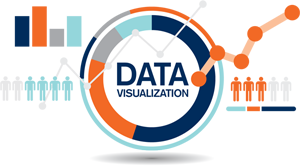
Sometimes it can be hard to tell a story or convey meaning using statistics by simply posting the numbers. That’s where “Data Visualization” comes in.
I like this definition from IBM:
[/col]
[col size=”7″]
[/col]
[/row]
Data visualization is the process of translating large data sets and metrics into charts, graphs and other visuals. The resulting visual representation of data makes it easier to identify and share real-time trends, outliers, and new insights about the information represented in the data.
Colorado’s Department of Public Health and Environment has a tool that does just that. VISION, their Visual Information System for Identifying Opportunities and Needs, is an interactive data tool that allows you to pull up maps, charts and graphs on chronic disease and behavioral health measures in Colorado.
VISION includes area profiles, data displays at the state and county levels, and data by demographics. The system also links to the data sources used for each graph or chart, making it easy to access the raw data.
Topics include:
[row cols_nr=”2″ class=”narrow”]
[col size=”6″]
- Alcohol and Other Drug Use
- Arthritis
- Cancer
- Diabetes
- Health Care Access and Quality
- Heart Disease and Stroke
- Mental Health
- Multiple Chronic Conditions
- Nutrition
[/col]
[col size=”6″]
- Older Adult Health
- Oral Health
- Physical Activity
- Respiratory Illness
- Sleep
- Social Determinants of Health
- Sun Safety
- Tobacco
- Weight Status
[/col]
[/row]
VISION is a rich resource for anyone interested in learning about current health trends in Colorado.

- Have you Registered to Vote? - September 17, 2024
- The Castlewood Canyon Flood of 1933 - August 3, 2023
- Holiday Selections - December 22, 2022