
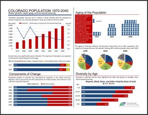
The State Demography Office has put together a series of infographics on population change, labor, and households for Colorado back to 1970. (Infographics are short one-page graphs or charts accompanied by quick data, maps, etc.) A quick glance at the infographics shows a significant population increase in Colorado since 2000. Other infographics present pie charts and other graphs showing the state’s age distribution; labor force statistics; and household growth as related to size, age, and household composition. If you need quick facts on population in Colorado, these infographics are a helpful resource. The website also offers the infographics in PDF form so they can be printed as posters, etc.

Former Technical Services Librarian at State Publications Library
Latest posts by Amy Zimmer (see all)
- How to Spot the Differences Between Eagles and Hawks - August 16, 2021
- How Transportation Projects Help Tell the Story of Colorado’s Past - August 9, 2021
- Time Machine Tuesday: The Night the Castlewood Canyon Dam Gave Way - August 3, 2021